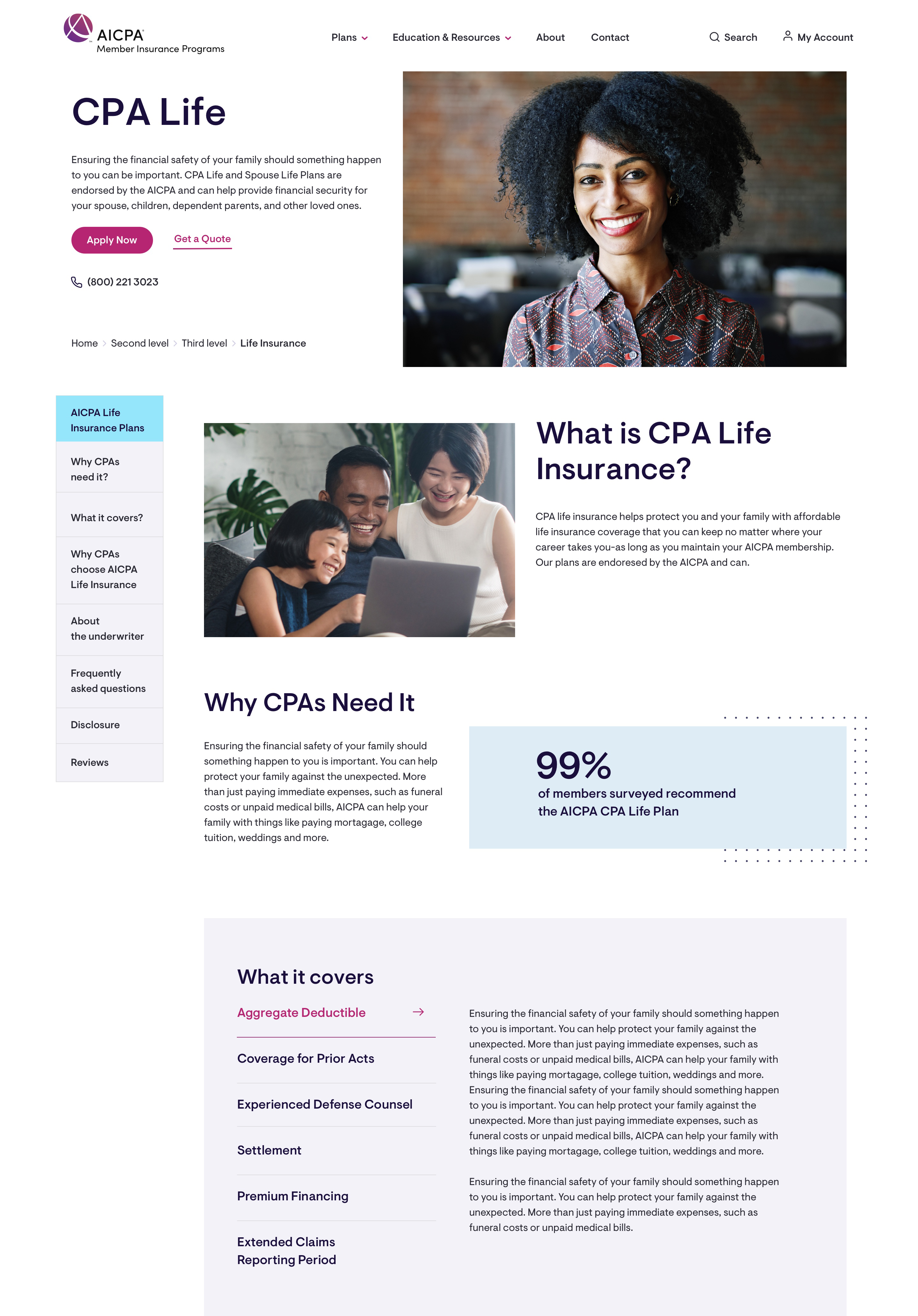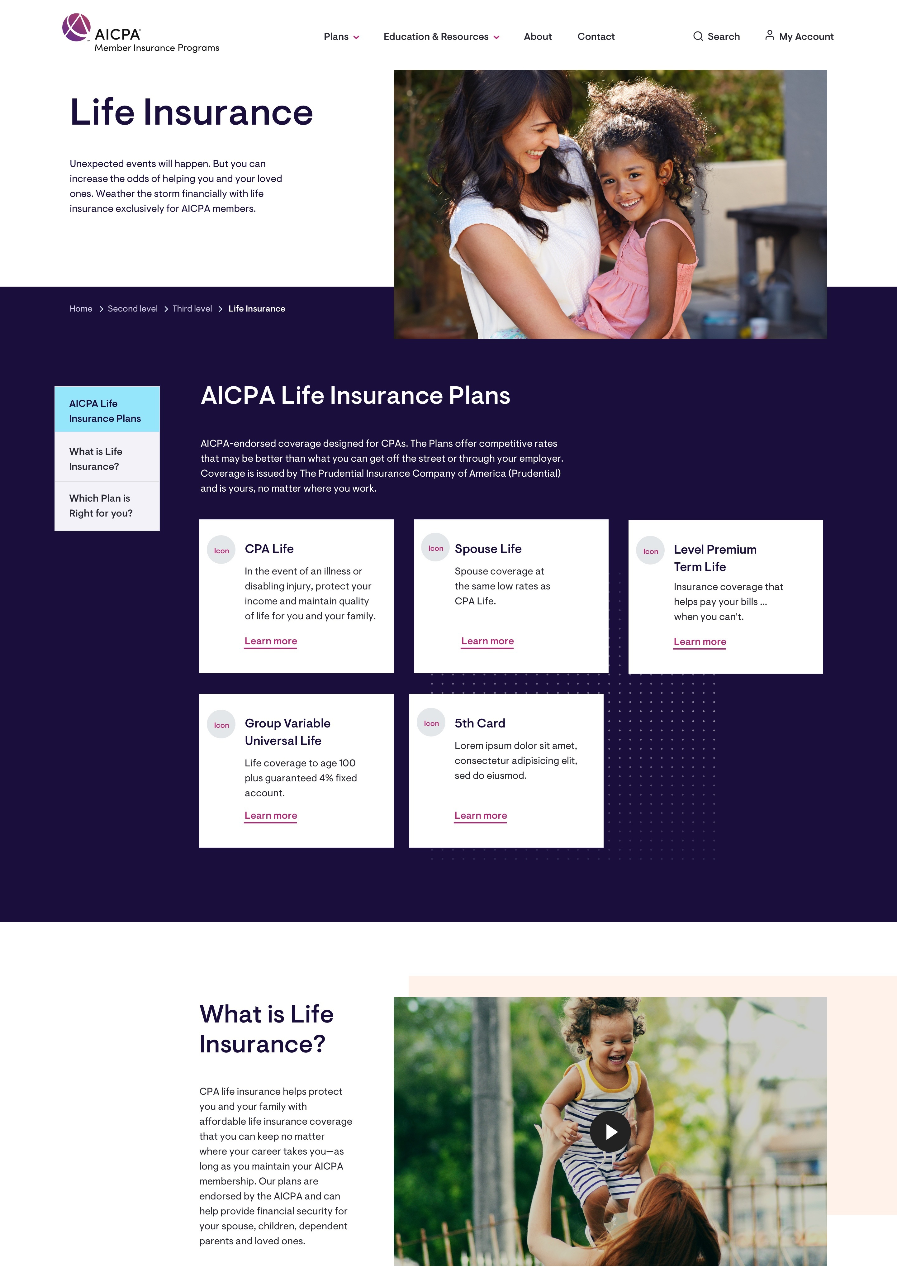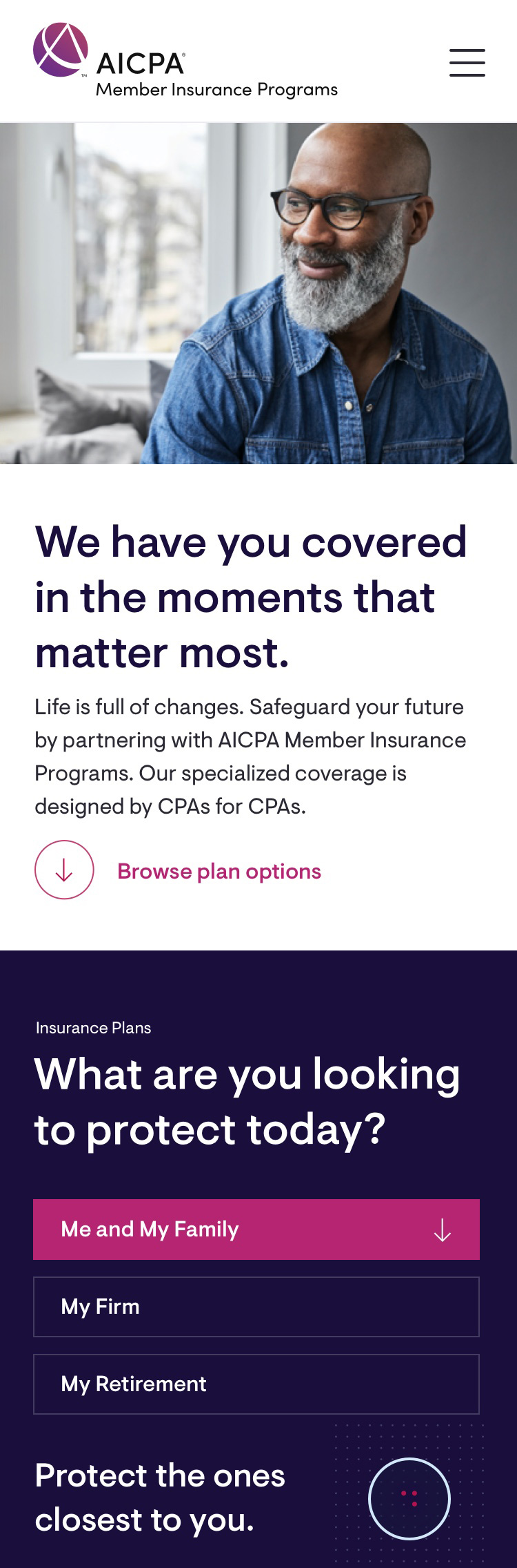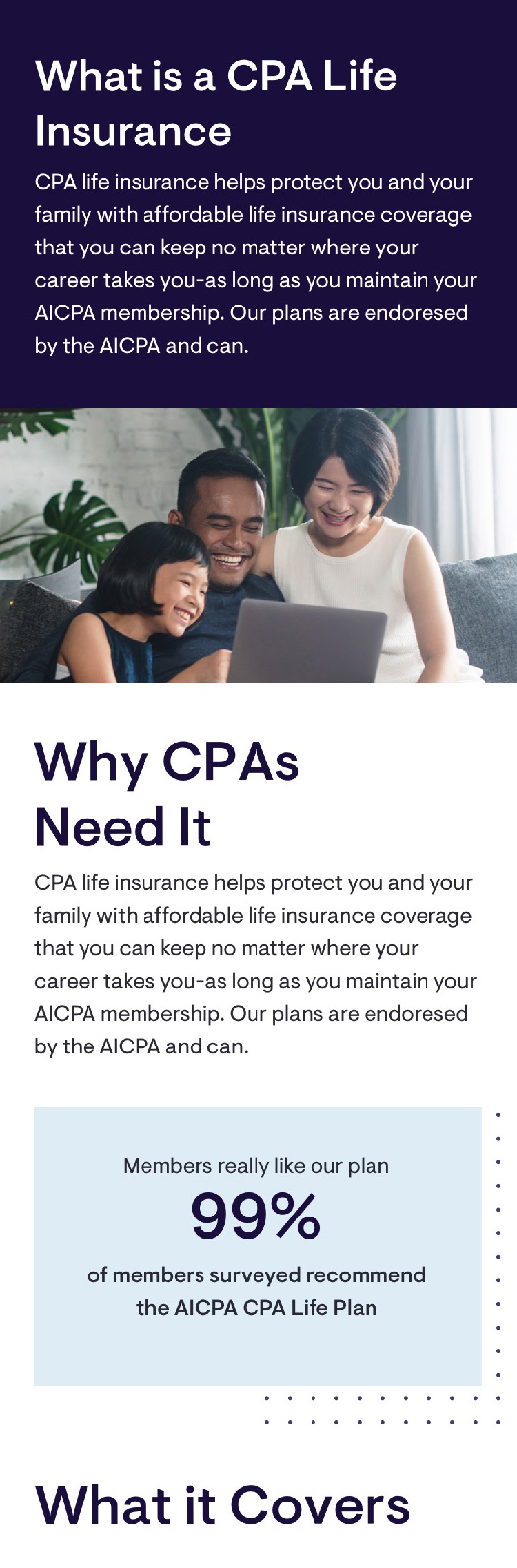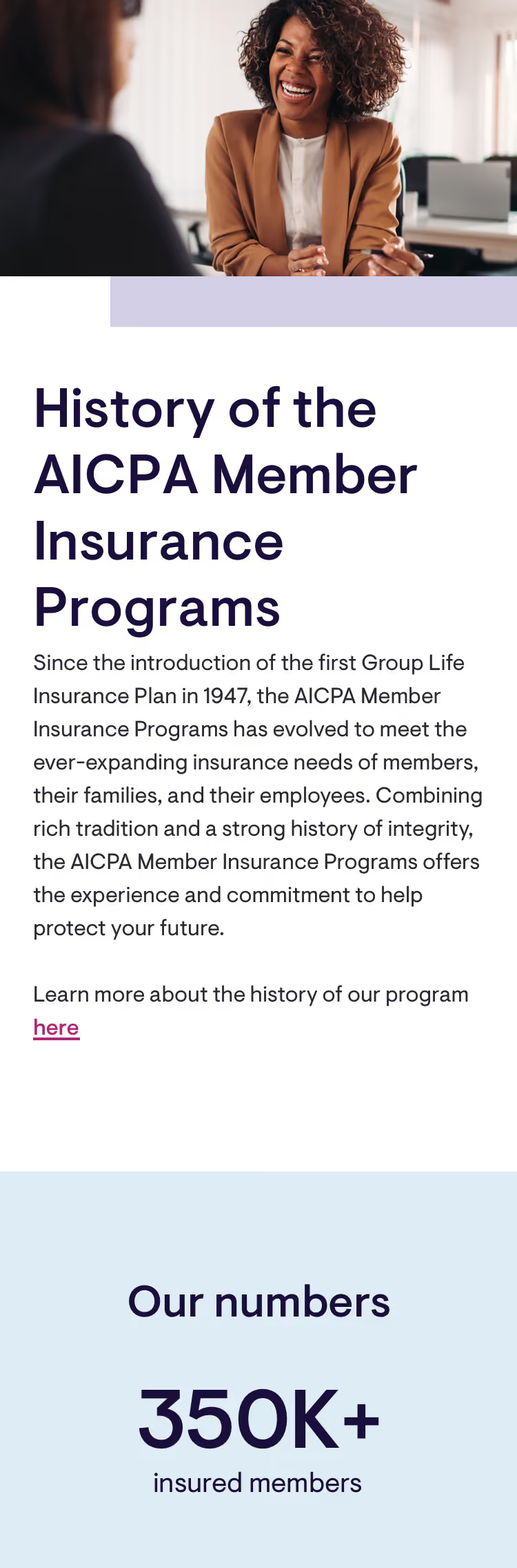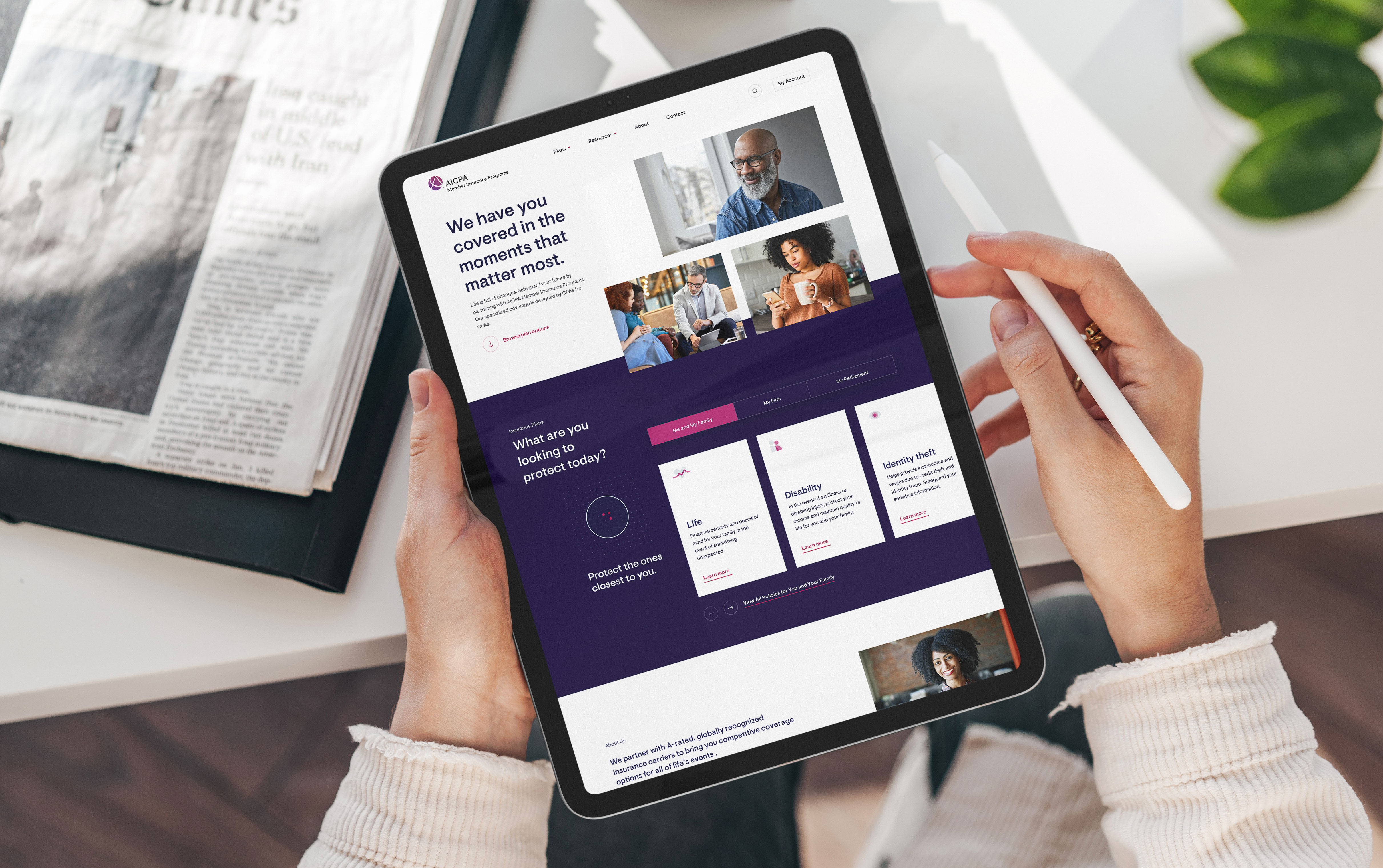
AICPA's member insurance site was doing its job the way an old form letter does its job — technically functional, forgettable everywhere else. Aon Affinity brought us in to fix that: more page views, a smoother path to a completed quote, and a digital experience that actually looked like it belonged to the country's most respected accounting body. The scope covered a full brand and content strategy plus production-ready design across the site, for a client who checked in like it mattered. Because it did.
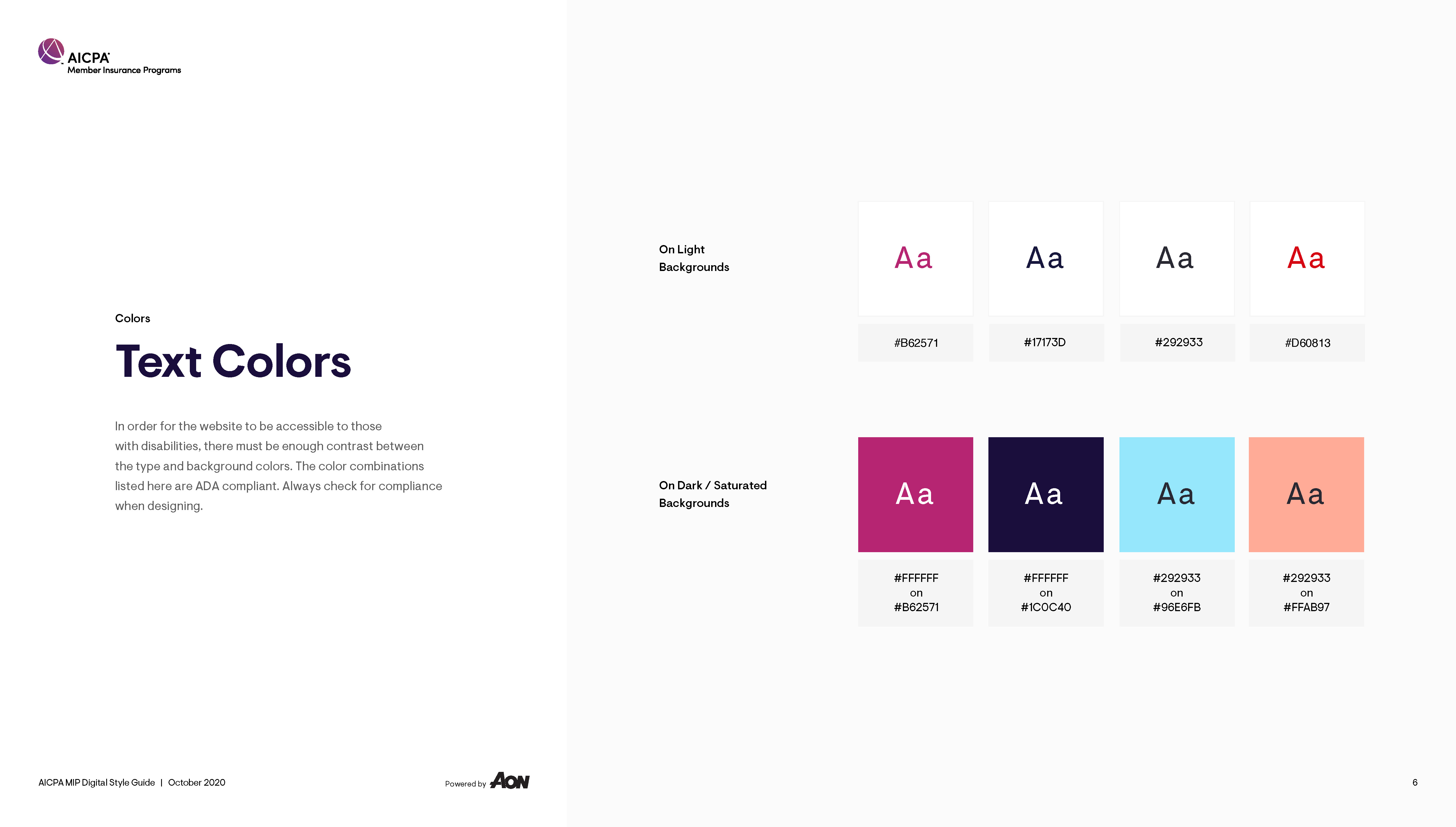
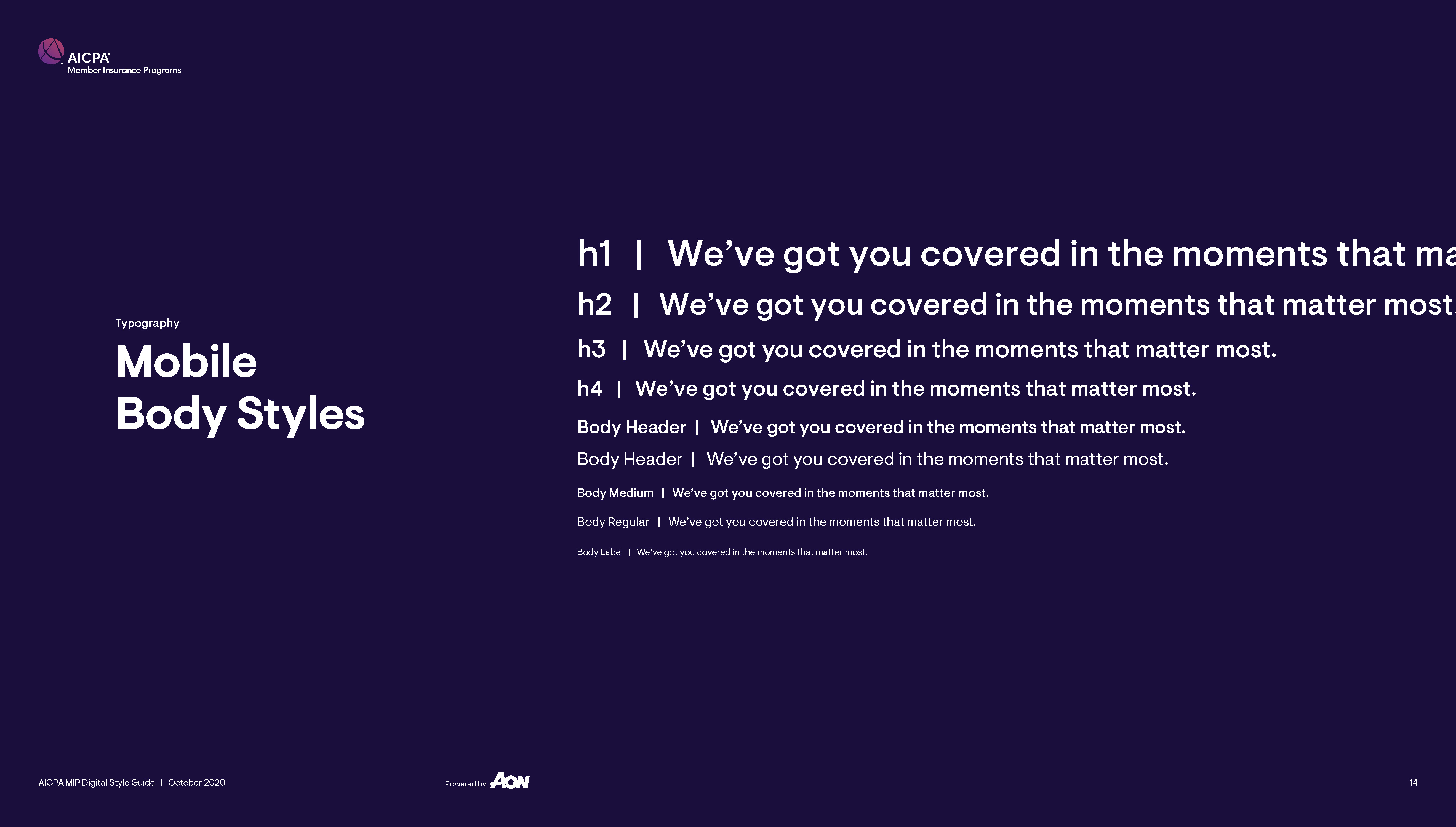
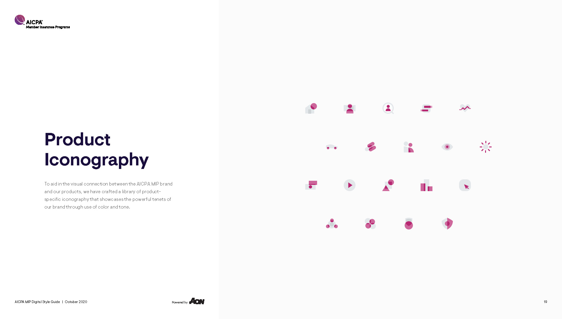
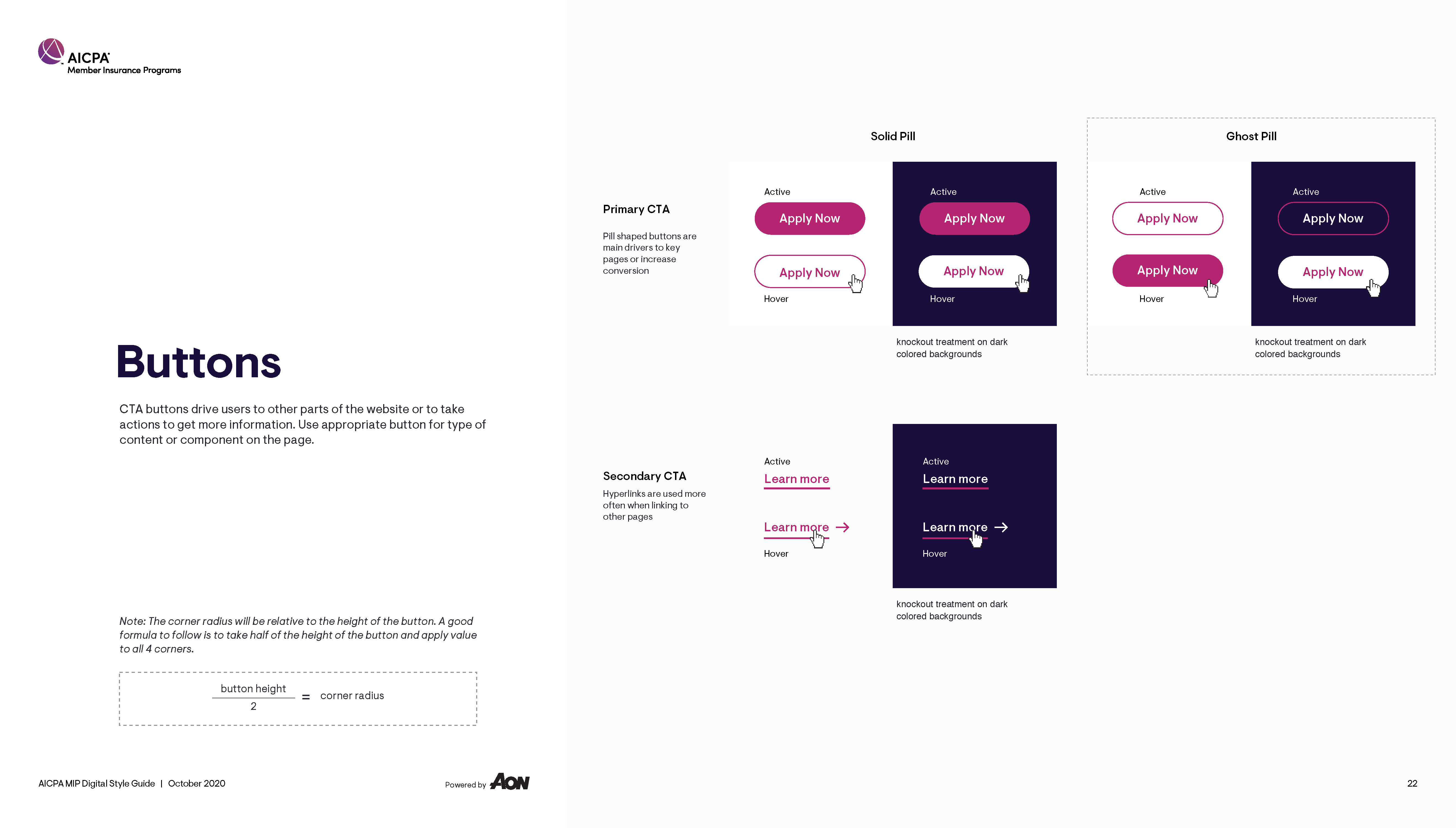
We started where a proper redesign should: kickoff workshops, moodboards, and an honest audit of what was already there. From that came a visual language built from scratch — a sharp, distinctive typeface, a cooler and more trustworthy color palette, and a grid disciplined enough to feel like the institution it represented. Iconography got the same treatment: two-color, custom-built, meant to read as premium rather than decorative.
Design moved through four two-week sprints, each one reviewed and signed off by Aon before the next began. Their hands-on style meant tight feedback loops and few surprises — every comp, every color choice, got vetted in realtime instead of discovered at the finish line. It kept the whole team sharp. A multi-discipline creative group carried it from foundational strategy docs through full production-ready UX and visual design assets, all of it built to feel cohesive with AICPA's existing internal design system instead of fighting it. Development was handled elsewhere; our job was to hand off a system solid enough to build on.
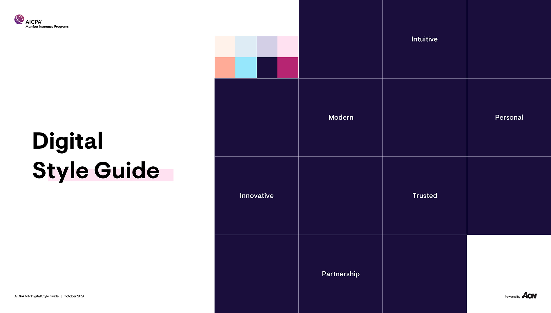
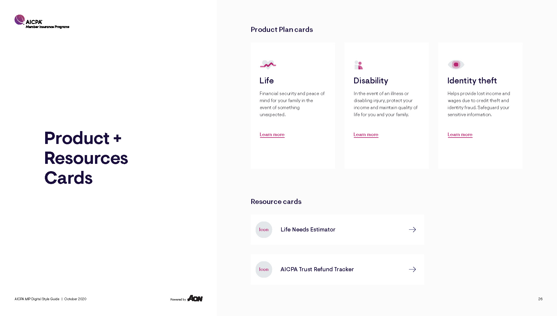
Aon walked away with a design system built to outlast the handoff — page templates, a documented style guide, a custom icon library, and content standards their team could keep using well past our sprints. I don't have post-launch numbers to point to here; our scope ended at design, not development or measurement. What I can say is it held together. Cohesive, on-brand, and built by a team that stayed alert because the client stayed close.