Only 9% of DSG customers knew the Foundation existed. That's the number that kicked everything off. People were donating at the register without knowing what they were donating to.
The old site didn't help. It was built to chase two things — donations and funding applications — and everything else got buried, including the mission itself. Dark, heavy, image-loaded, and rough on mobile, where most of this traffic actually lives. If you landed on it cold, you couldn't tell where the Foundation ended and the Sports Matter campaign began. Two different things wearing the same shirt.
We looked at what Nike, Adidas, and Laureus were doing in the same space. Every one of them made you dig for the mission. That was the opening — be the site where you don't have to dig.
Small team. UX, design, and copywriting, working from an approved architecture up through two look-and-feel directions, then interior templates, a style guide, and hand-off docs for their dev team to build. I was ECD on it, sitting between the client and the creative — making sure what we were designing actually solved the awareness problem DSG brought us, not just a prettier version of what was already there.
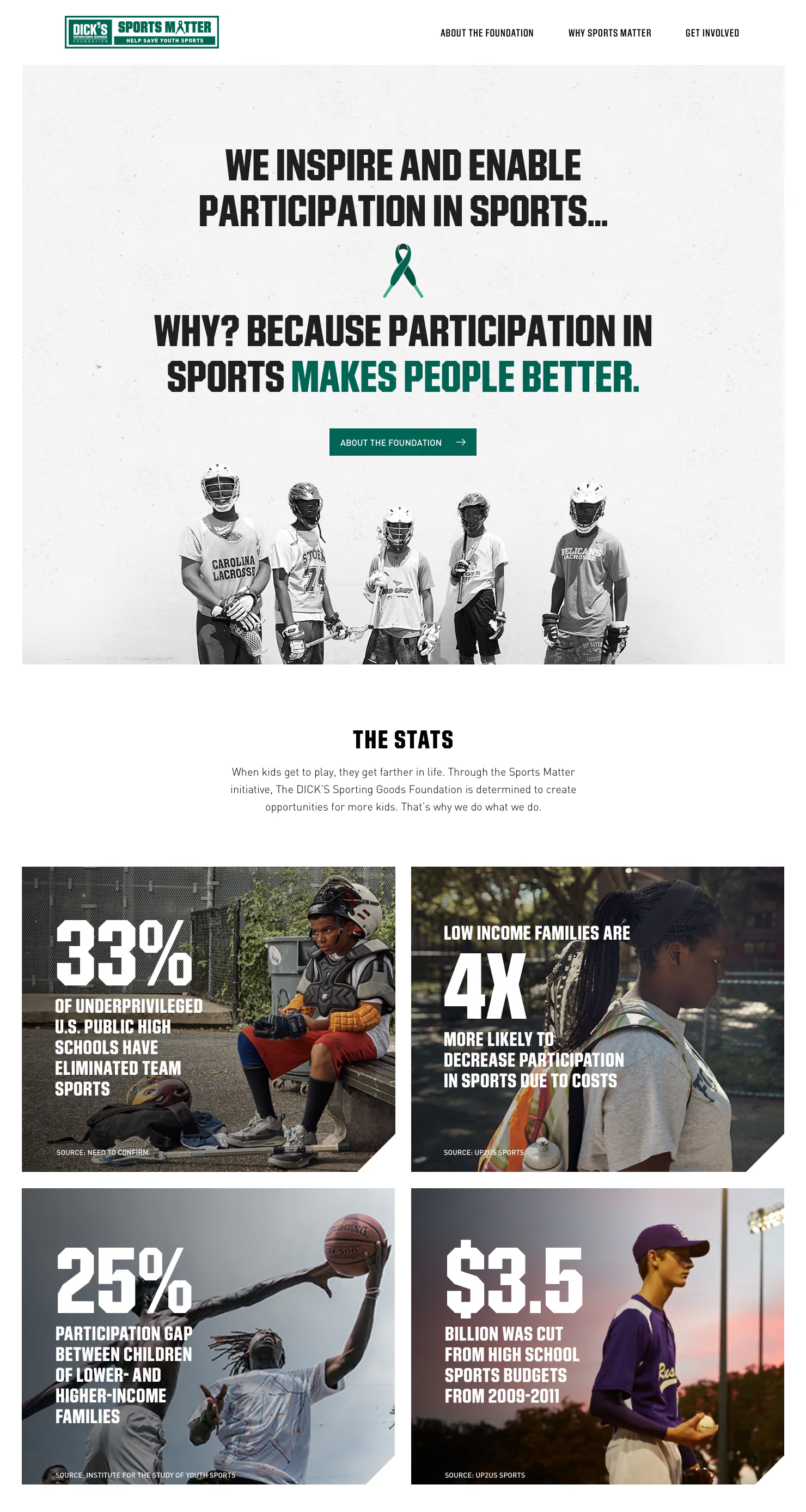
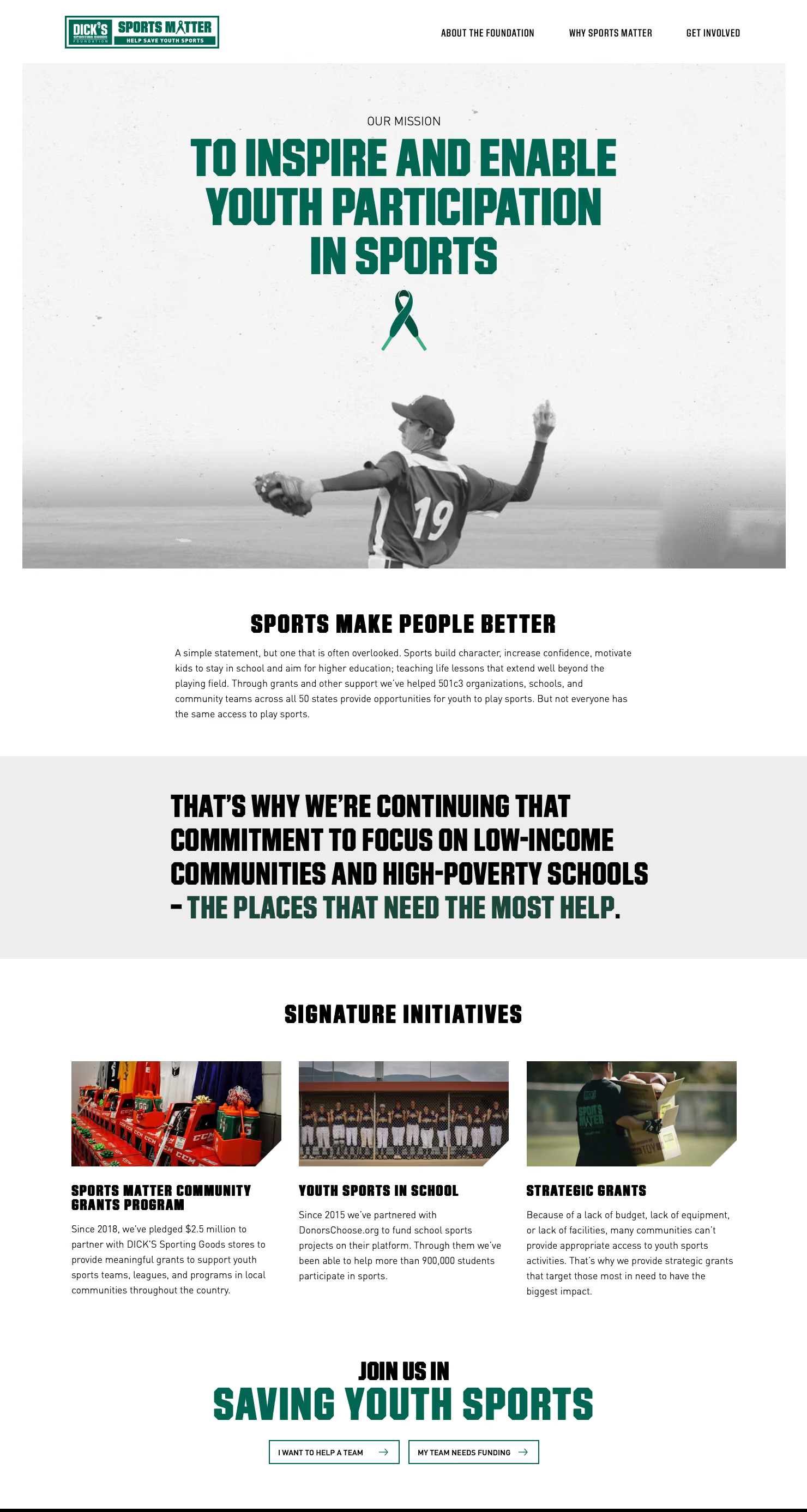
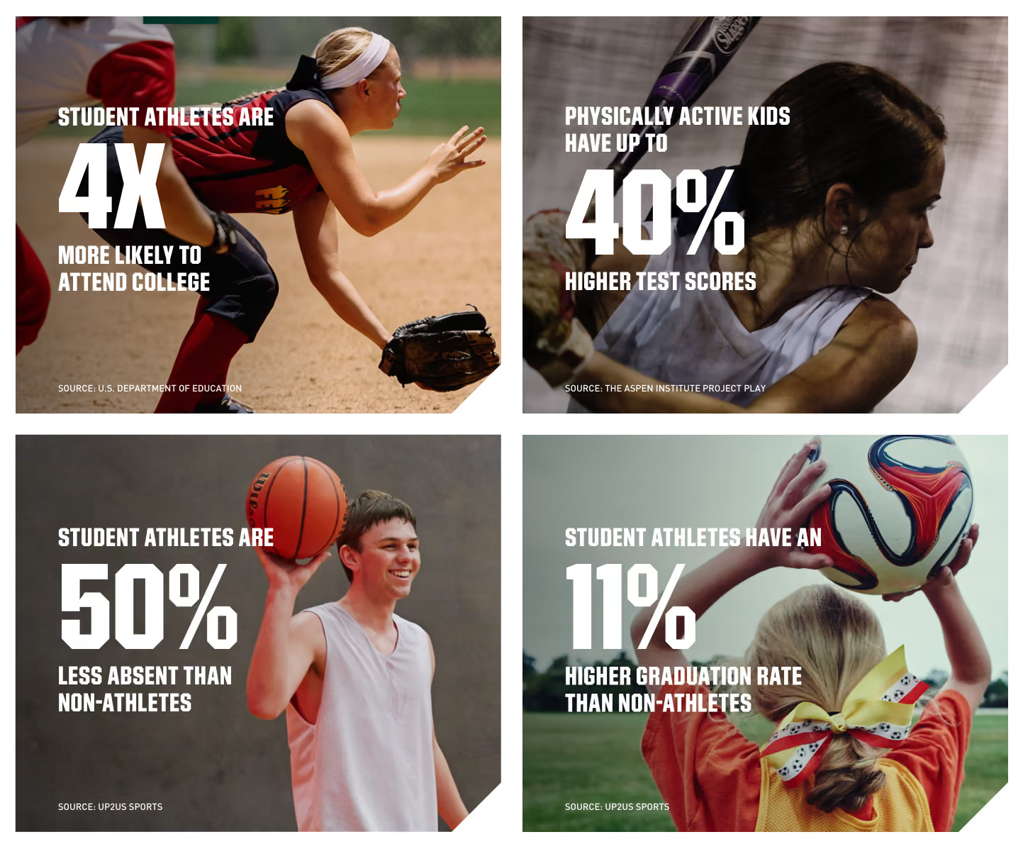
The fix wasn't clever, it was structural. Lead with the belief — sports make people better — before you ever ask for a dollar. Split the Foundation's identity clearly from the campaign. Let real statistics carry weight instead of getting lost in dense copy blocks. And build it mobile-first, since that's genuinely how people were finding it.
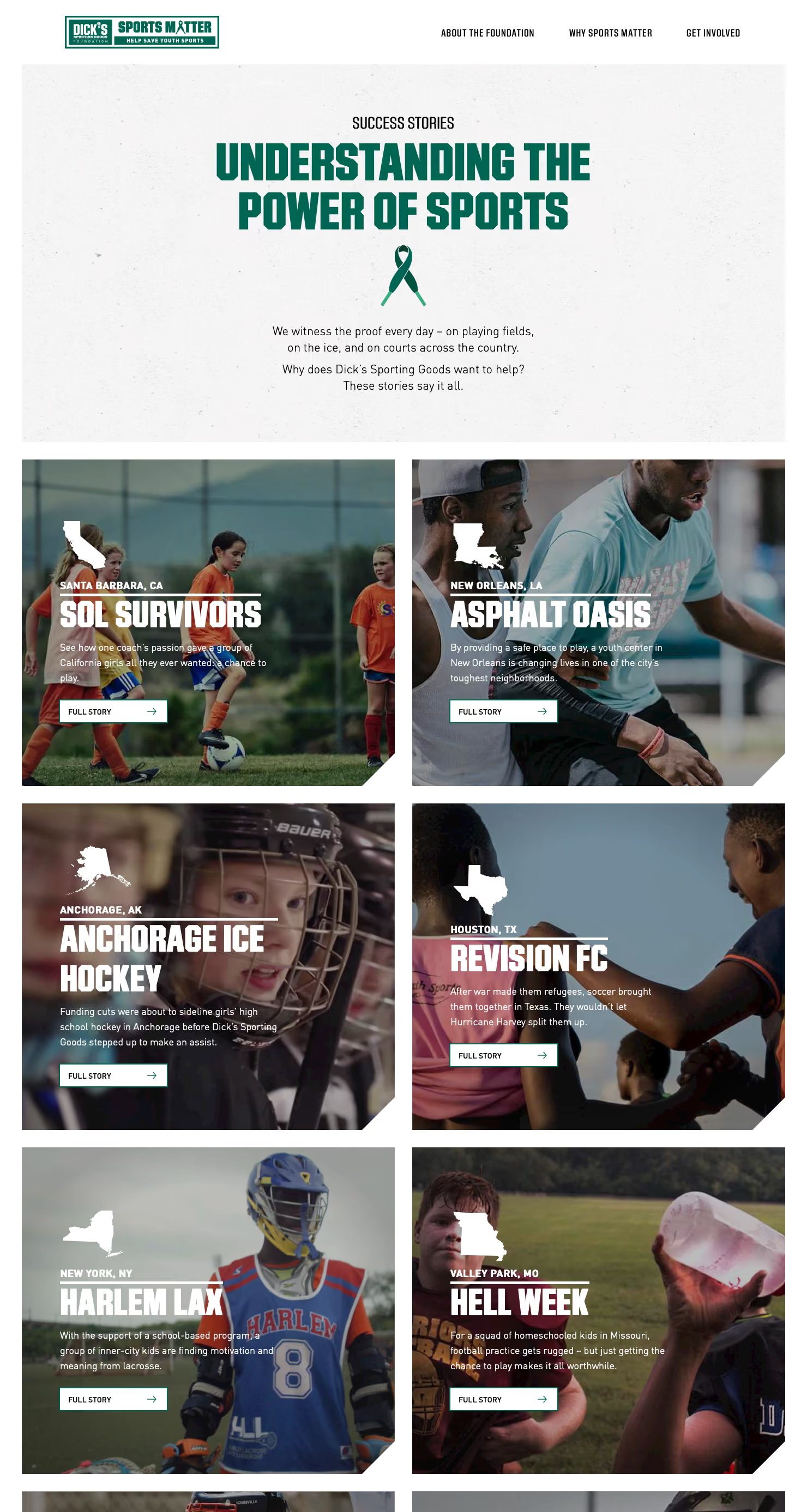
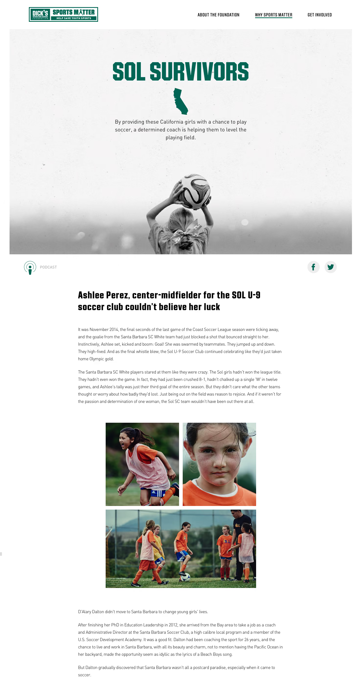
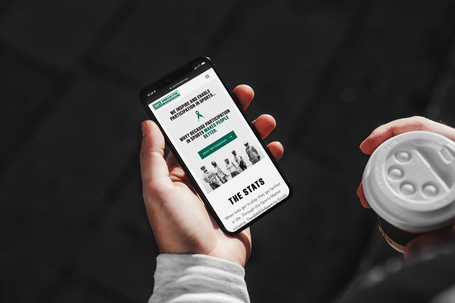
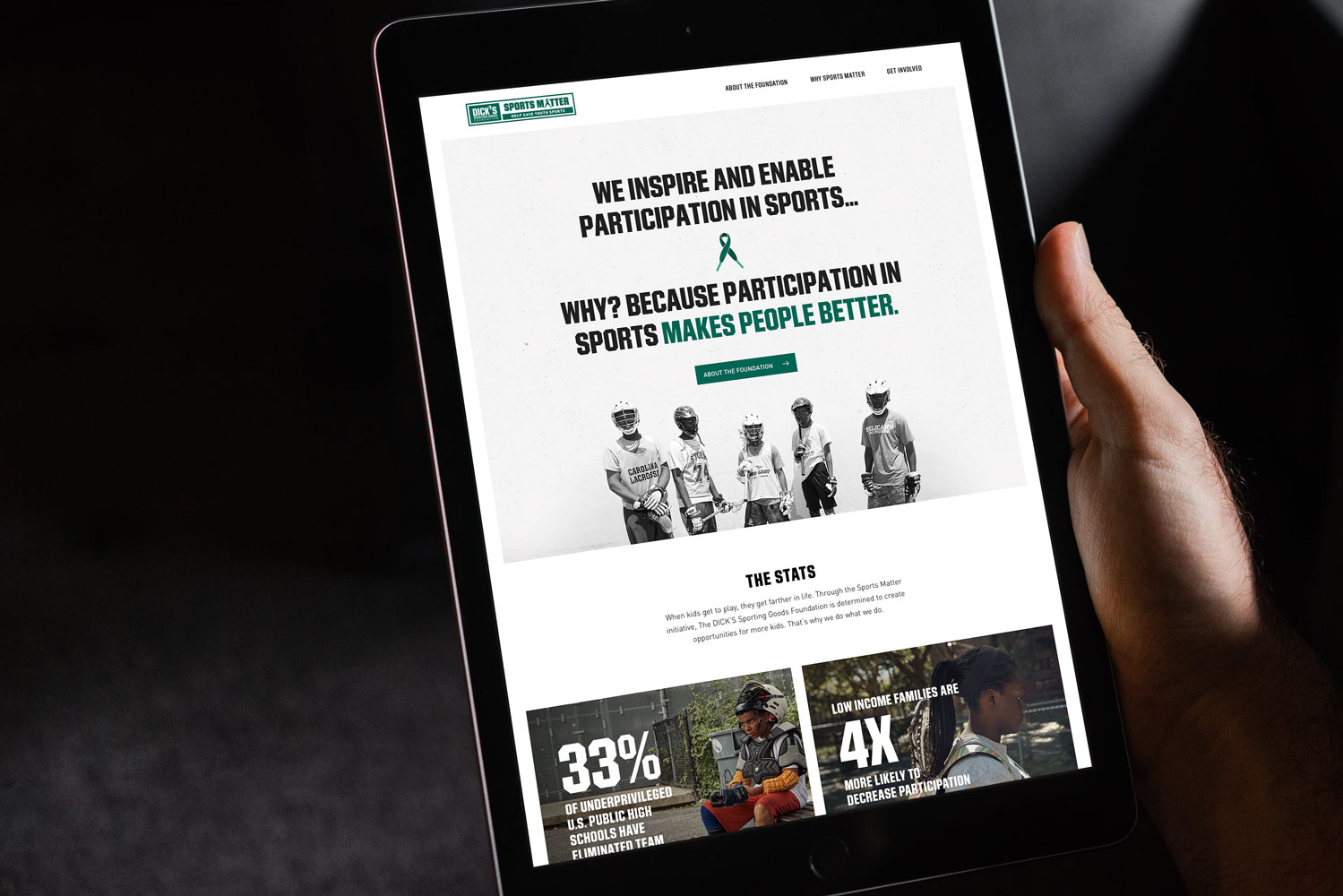
Visually, we went the other direction from the old site: high-end black-and-white photography, real whitespace, a premium, editorial feel instead of a wall of graphics. A cause this straightforward deserved a site that got out of its own way.
The new site simplified the navigation, refocused the message, and gave the Foundation a look that actually matched the weight of what it does. Before and after, it wasn't a redesign — it was a different site making a different case.
I grew up near the original DICK'S in Binghamton. Bought my first baseball glove there. Working on this one felt different — knowing kids somewhere are getting their own first glove because a program like this existed for them. Feel-good projects don't come around that often in this business. This was one of them.