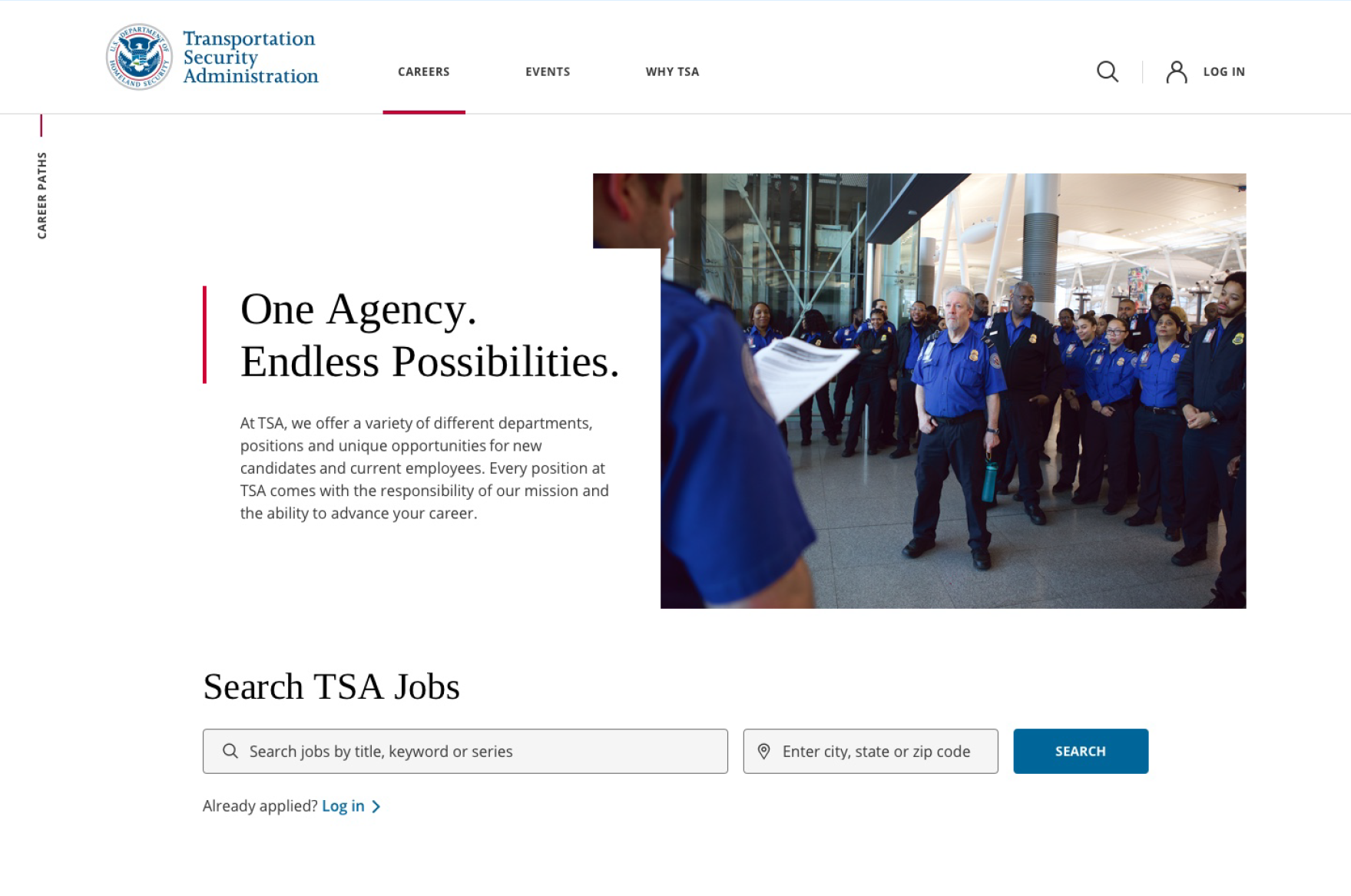
The TSA's candidate website was outdated. Not in a charming retro way—in the way that made people click away. The aesthetic felt stale, the information architecture was buried, and candidates couldn't easily navigate the path from "I'm curious about a career here" to "I know what this job actually is." The result was predictable: high abandonment, too many calls to the HC Contact Center, and marketing dollars spent trying to drive traffic to a site that didn't do the work of converting interest into applications.
The bigger problem underneath: candidates had no sense of what working at TSA actually looked like. The imagery was generic. The tone was bureaucratic. There was no human element—just forms and job descriptions that could have applied to any agency.
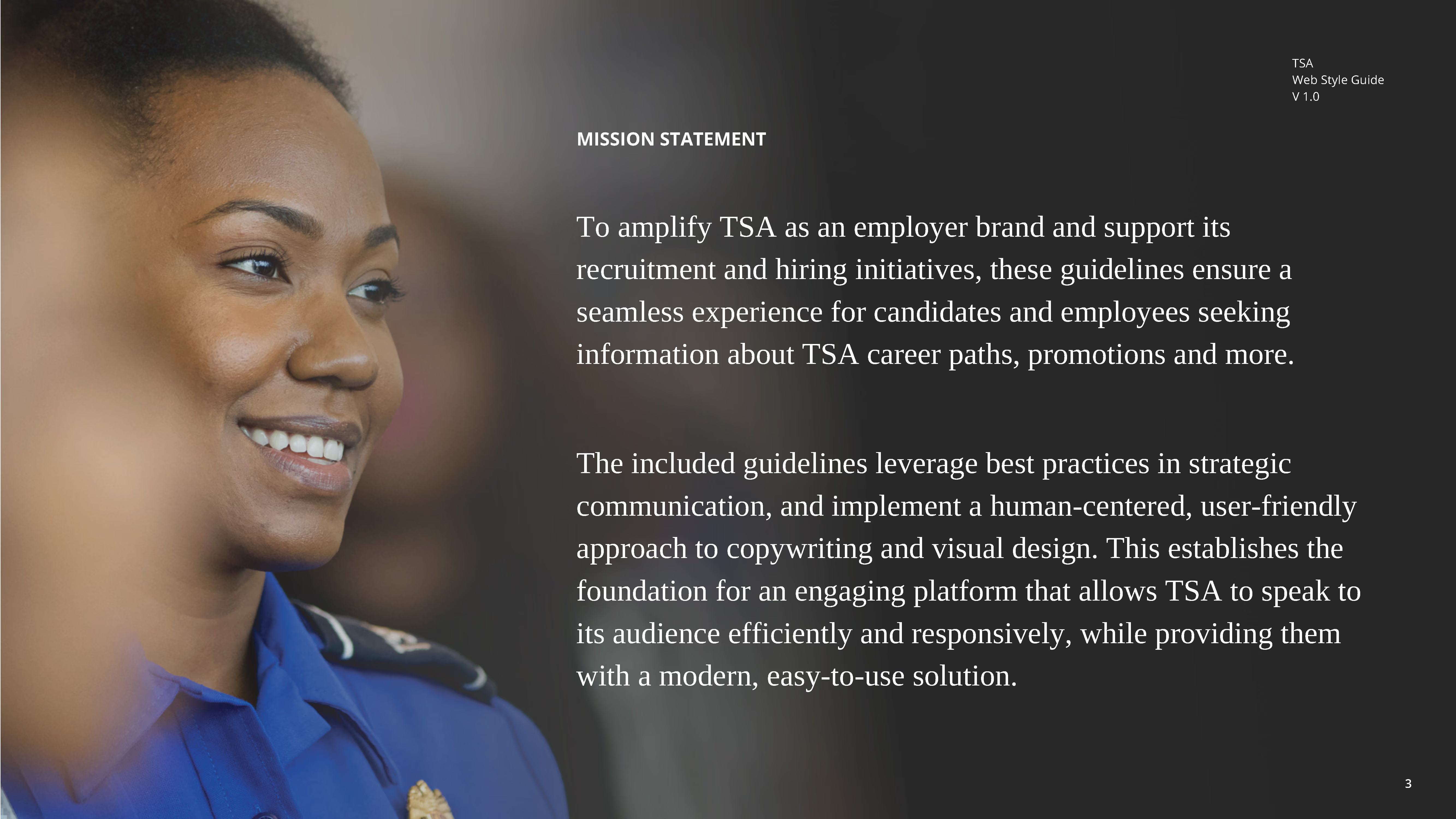
The insight was straightforward but uncommon: show real people doing real work. Not stock photos. Real TSA officers, screeners, analysts, and specialists in their actual roles.
So we organized a multi-day photoshoot at JFK. Brought in actual TSA employees across different career levels and functions, photographed them in their environments, in their uniforms, doing the work. The goal was simple—when a candidate landed on the site, they'd see someone who looked like them, in a role they could picture themselves doing. Authenticity became the differentiator.
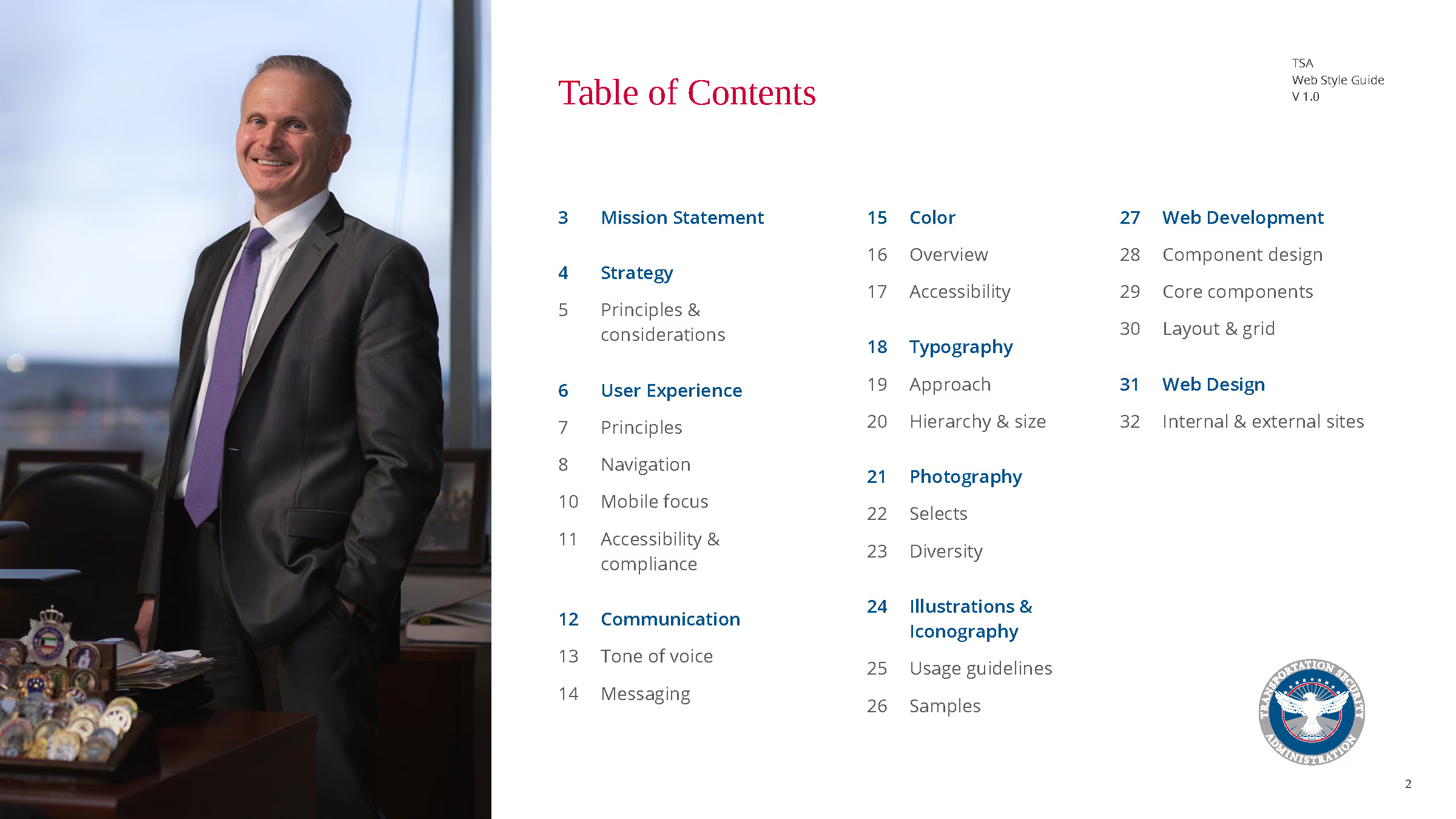
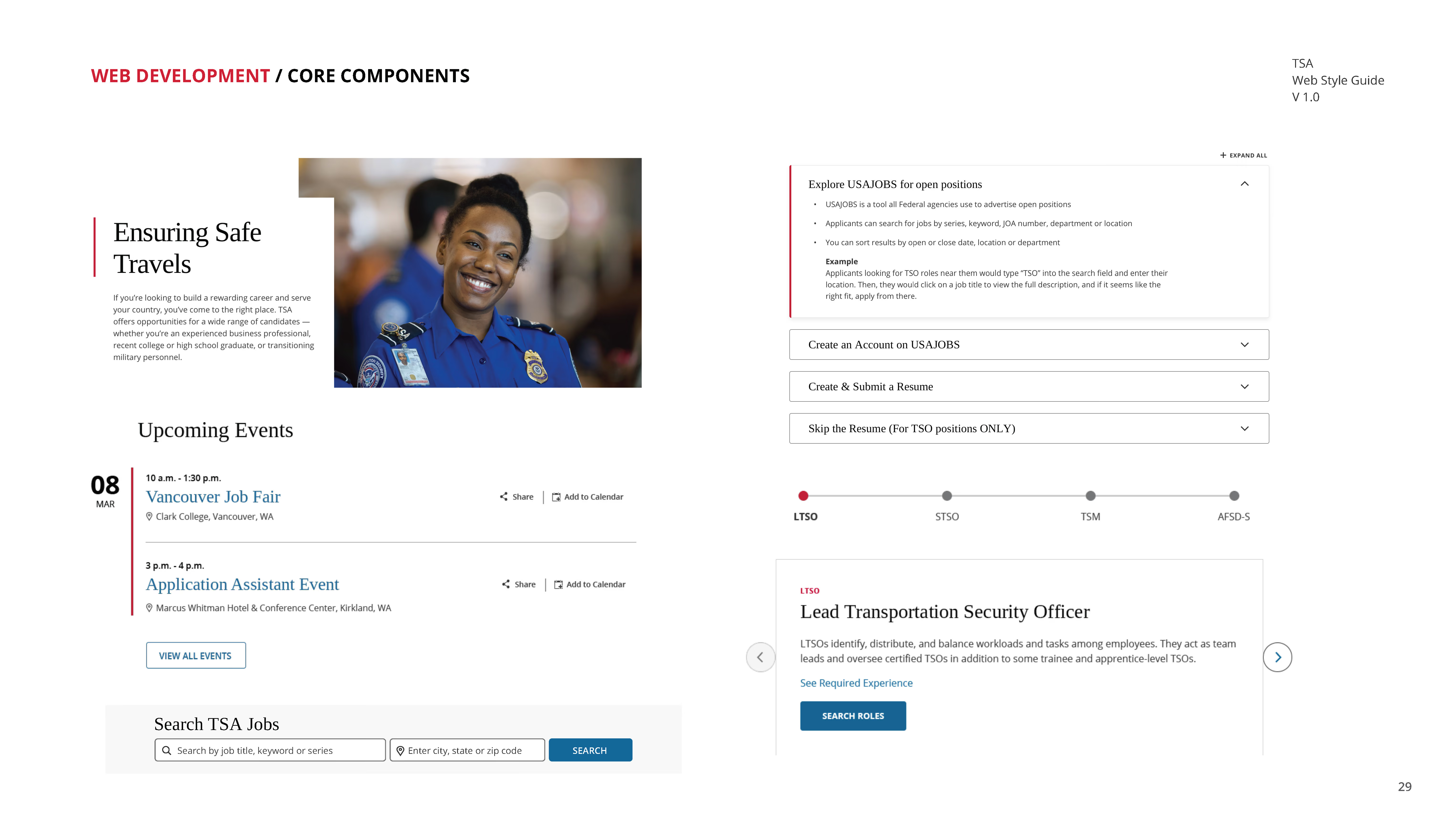
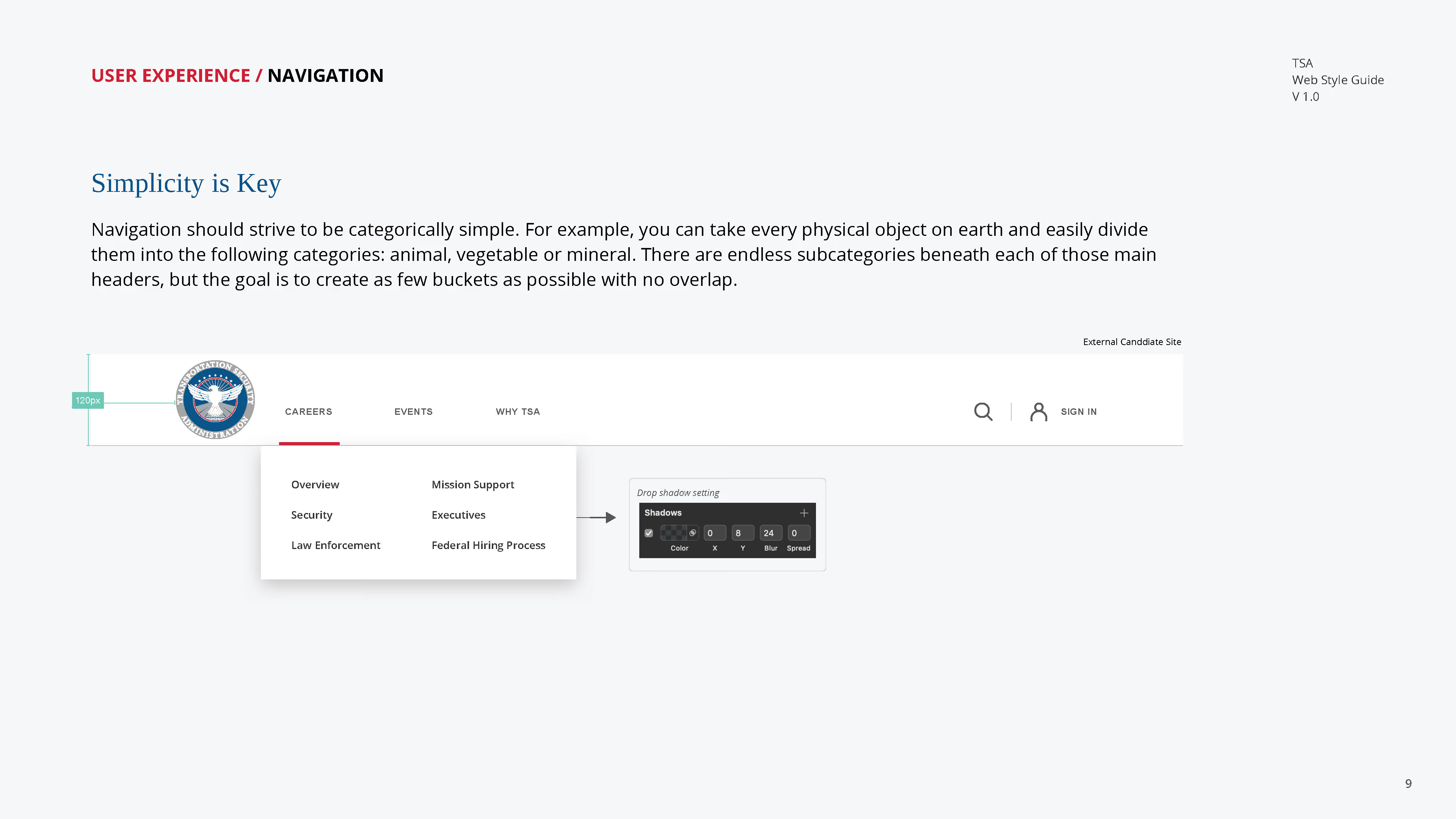
From there, we rebuilt the entire candidate experience. A unified design language that felt modern and approachable. Clear information architecture that guided candidates through career paths and promotion ladders without the maze. Copywriting that spoke directly to candidates—explaining what the work actually was, what the compensation looked like, what the benefits were—in language that didn't feel like it came out of a government manual.
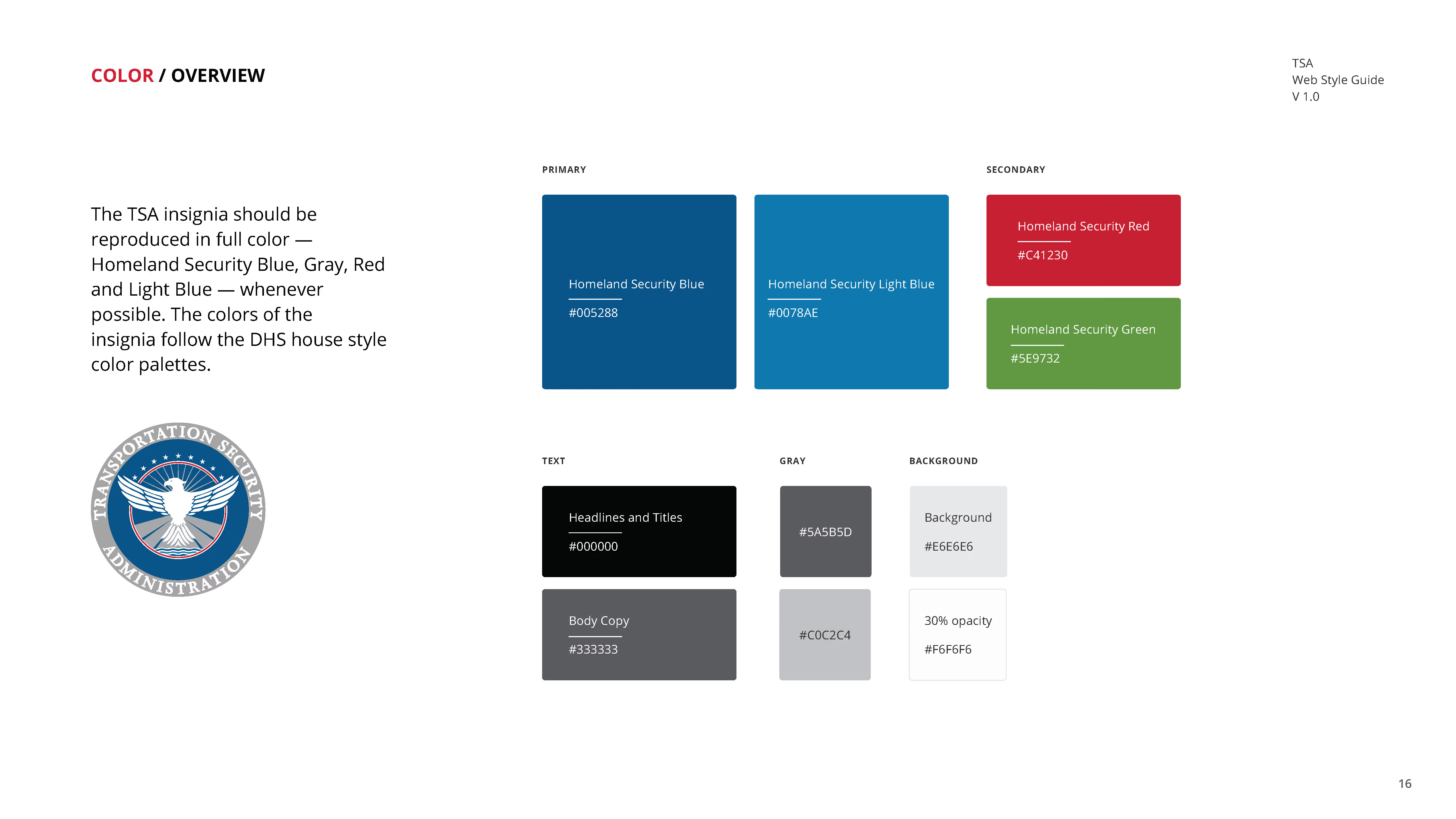
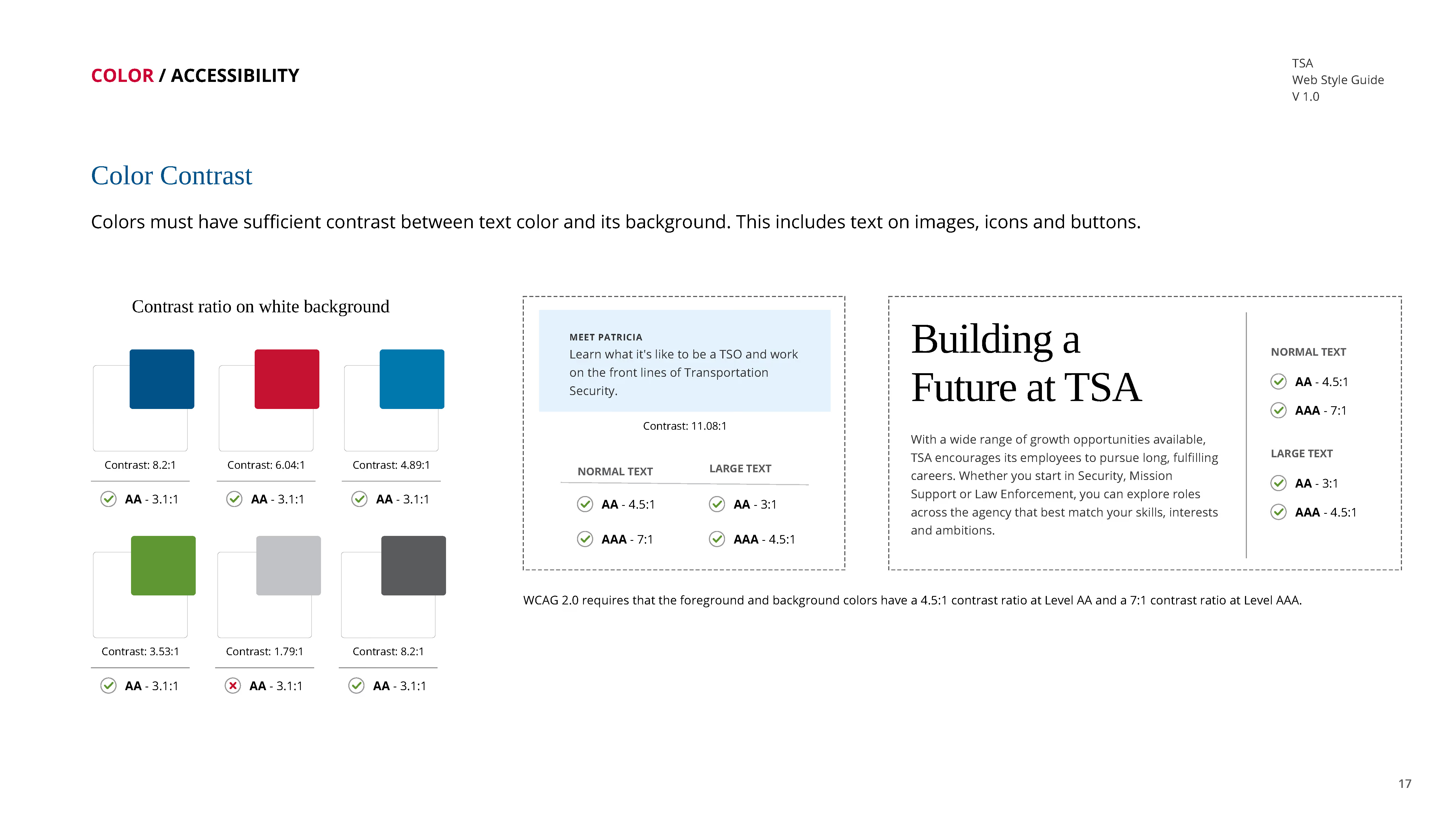
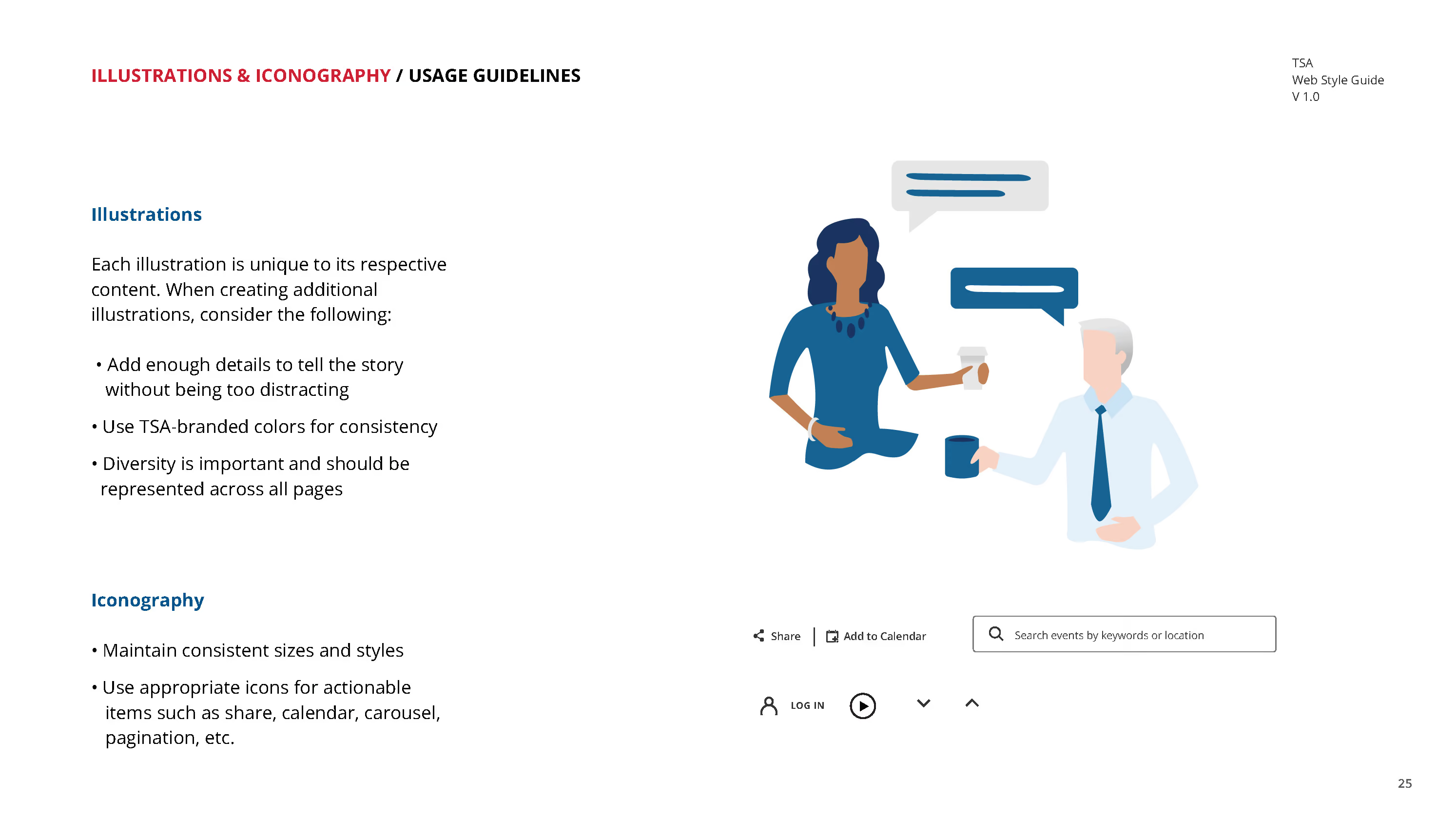
We created guidelines that became the foundation of everything: tone of voice, visual system, component patterns, responsive design. Not a one-time refresh. A scalable framework so TSA could evolve and add new content as hiring needs changed and the agency grew.
The work was built to do one thing: reduce friction. A candidate website that treated people like they were applying for a job they actually wanted—not filling out a form at a DMV. Real people on real screens. Clear paths through career information. A unified visual and verbal identity that said "this is a real employer with real opportunities."
The guidelines we created became the foundation for how TSA would communicate with candidates moving forward—the tone of voice, the visual system, the component patterns. The rest was about execution: training the team on how to use it, making sure the platform supported what candidates actually needed to make a decision, and removing every obstacle between interest and application.